Recent Work

Logo + Identity Design Process: The Stranded Sheep

This design project is so close to my heart! Not only is Barbara Billings of The Stranded Sheep a great friend of mine, she's a creative entrepreneur doing one of the coolest things I can imagine: she takes wool from sheep, spins and dyes her own yarn.

I was so honored when Barbara asked me to design her logo and brand identity for The Stranded Sheep! I was excited to learn about spinning, dyeing and fibers in general. I love working with entrepreneurs because there’s so much soul in the company. Most entrepreneurs start projects that are a direct reflection of themselves. It starts with something they liked to do, but there’s always a really meaningful reason why. I love that. To kick the project off, Barbara and I met up for a brainstorming session and worked on compiling a Pinterest board. From there, I got to work and prepared her concepts:

Brand Themes

Brand Themes for The Stranded Sheep Brand Identity 

Barbara learned to knit and followed the supply chain back from there all the way to the farm. Her desire is to one day own her own sheep farm. She wants to host the entire supply chain, from farm to skein. She finds so much joy in returning to the simple. She’s worked in the digital space for so long, that she has incredible value for the things you can touch. Knowing all this, I came up with some brand themes. These are the themes that would guide the logo concepts and color choices. You should be able to look at each piece of the brand and see these themes: earthy natural elegance, composed, classic, but not too careful, and relaxed strength. Looking at the left column in the chart above, you can see how these themes translate into design elements.  

Colors

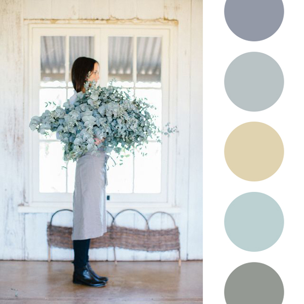
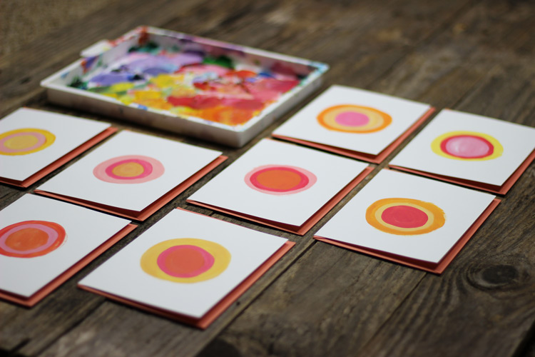
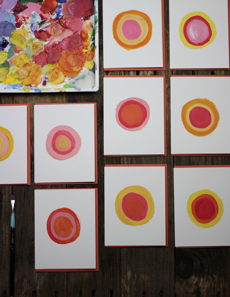
Along with the brand themes, I chose color palettes and photographs that reflected the themes.

Concepts

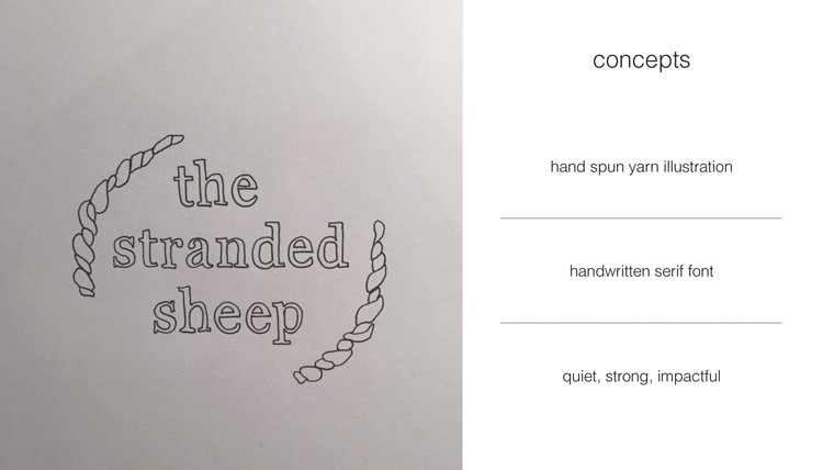
Then I sketched out some logo concepts. These are quick sketches, each one playing up a different aspect of the brand themes. 

Recommendation 

I always like to give my recommendation. Designers always have favorites. I think instead of trying to strategically place items in a deck, it's best to just to tell your client who your favorite is! This was my official recommendation for Barbara. We met up and talked through everything. After getting a good understanding of her feedback, we started revisions. 

The Final Brand

Ta da! The final brand! Working on this project was such a wonderful shift from my usual. Dusty and I usually team up for design, but I was selfish with this one! I loved having a chance to work with a more feminine brand and getting to use my lettering skills. I am so excited to see The Stranded Sheep grow! 


If you'd like to learn more about logo and identity design, head over to our about page and drop us a line! Let's build a brand you love!

Bright Blue Circles

Abstract Folk Art | Mad and Dusty | Atlanta GA

So excited to launch this collection of bright blues, purples and mauves! I'm now offering hand lettering and customization too. Check out my Instagram for examples! If you'd like to add to any of the pieces before buying, just drop me a line below or on Etsy. Let's collaborate!

Peach Painted Notecards Up in the Shop!

Peach Circle Note Cards from Madison Beaulieu

I started painting these little peach beauties when dealing with stressful situations at work. I would wake up super early, grab my coffee and sit in my studio before the sun rose. Maybe I should have been doing yoga or running, but I didn't have much energy at that time. I would fill my jar with water and grab my mom's old paint brush and just paint circles. Circles, on circles, on circles. I was thinking I'd wait and paint these on canvas, but I had all these blank note cards sitting around and thought - why wait? I should just make something.

Peach Painted Note Cards from Mads Beaulieu 

Just make something. I think this phrase has influenced my life in so many ways. It was a common theme growing up. I would sit down when I was younger and just make something. It didn't quite mater what it was. Usually it was an off shoot of the arts and craft trend my mom was trying out at the time. (We had and still have so much fun!) 

I just had to make. Make do. Make it work. Make.

My work situation has changed now. I'm working with Paint Love and also back at designing with Mad & Dusty. There's still stressful moments, but the kind that come from doing something you really believe in. It's more of a "You're doing something that makes you feel alive and pushing yourself to your edges" kind of stress. I'm not painting as many circles, but I still love these little guys. I'm proud of the period of time they represent. These peach circles are a good illustration of the fact that life moves in a circle. That every end is just a beginning, and that every beginning is also an end in some way. It's a symbol of growth and renewal, but also of familiarity and stability. Life doesn't have to be perfect to be beautiful. Often, the most beautiful things are not perfect at all. 

Painted Circles - Notecards by Mads Beaulieu

There's something so empowering about putting things up for sale. Ahh! If you'd like to purchase a set of three circle notecards, head over to our Etsy Shop and use the coupon code OCTOBER20 for 20% off the whole store. There's not much to choose from right this second, but we will be adding a ton of products this month! (Coupon will expire on 10/31.)

Thanks so much for reading and supporting Mad + Dusty as we grow! 
Mads